Building a checkout page
A checkout page is one <form> that the SDK turns into a working checkout: package selection, customer fields, an order bump, hosted card fields, express payment buttons, and a live order summary. The SDK prices everything, validates the fields, creates the order, and sends the visitor to the next page. Every example below is condensed from checkout.html in the apollo starter template (campaign-cart-starter-templates), except the address block, which the template does not use.
The page declares itself in the head. See Getting started for the full boot setup:
<meta name="next-page-type" content="checkout">
<meta name="next-success-url" content="/upsell-1/">
Everything else lives inside the form root:
<form data-next-checkout="form" method="post"></form>Package selection
The bundle selector presents the offer tiers as clickable cards. Each card declares its cart contents as JSON; clicking a card swaps the whole cart to that tier.
<div
  data-next-bundle-selector
  data-next-selector-id="drone-packages"
  data-next-selection-mode="swap"
  data-next-include-shipping="true"
  data-next-await=""
>
  <div
    data-next-bundle-card
    data-next-bundle-id="drone-qty-1"
    data-next-shipping-id="2"
    data-next-bundle-items='[{"packageId":1,"quantity":1}]'
    data-next-selected="true"
    role="button"
  >
    <img data-next-display="package.image" alt="">
    <div>1x <span data-next-display="package.name">Package Title</span></div>
    <div data-next-bundle-display="hasDiscount">
      SAVE <span data-next-bundle-display="discountPercentage">-</span>
    </div>
    <span data-next-bundle-display="originalUnitPrice">-</span>
    <span data-next-bundle-display="unitPrice">-</span>/ea
    <span data-next-bundle-display="originalPrice">-</span>
    <span data-next-bundle-display="price">-</span>
  </div>
  <div
    data-next-bundle-card
    data-next-bundle-id="drone-qty-2"
    data-next-shipping-id="2"
    data-next-bundle-items='[{"packageId":1,"quantity":2}]'
    role="button"
  >
    <div>2x <span data-next-display="package.name">Package Title</span></div>
    <span data-next-bundle-display="price">-</span>
  </div>
</div>
The pieces that matter:
data-next-bundle-items: the tier's cart lines, as JSON.data-next-selected="true": the pre-selected default tier.data-next-selection-mode="swap": picking a tier replaces the previous one.data-next-shipping-id: a per-tier shipping method; withdata-next-include-shipping="true"the card price includes it.data-next-bundle-display: that card's calculated prices.data-next-await: the template's loading gate. The SDK adds thenext-display-readyclass to<html>when its DOM scan finishes, and the template'snext-core.csskeeps anything underdata-next-awaitinvisible until then, so the visitor never sees-placeholders flash. The SDK only sets the class; without that stylesheet the attribute does nothing.
Contact and address
The page writes the email field itself, and the SDK builds each address from the selected country's rules, the customer's name and phone included.
Below is an example of the email field, the shipping address, and a billing address that closes when the shopper ticks the box, with its labels and headings in the page's language.
<h2 data-next-i18n="checkout.contact.title">Contact</h2>
<label for="email" data-next-i18n="fields.email.label">Email</label>
<input
  id="email"
  type="email"
  autocomplete="email"
  required
  placeholder="Email"
  data-next-checkout-field="email"
  data-next-i18n="[placeholder]fields.email.label"
>

<h2 data-next-i18n="checkout.shipping.title">Shipping address</h2>
<div data-next-address="shipping"></div>

<label>
  <input type="checkbox" name="use_shipping_address">
  <span data-next-i18n="checkout.billing.same_as_shipping">
    Use shipping address as billing address
  </span>
</label>
<div data-next-component="different-billing-address">
  <h2 data-next-i18n="checkout.billing.title">Billing address</h2>
  <div data-next-address="billing"></div>
</div>
The SDK ships these headings and the email's label in every language it supports; Translated text lists the keys and covers the rest of the page's words.
Contact information
The contact step is the email field, which the page writes. The name and phone are part of the shipping address, so the address block builds them. Its label and placeholder take the page's language from the fields.email.label key (Translated text).
To ask for the name in the contact step instead, write the first and last name fields there as well. The address block builds no field the page already has, so the shipping address then starts at the country.
Below is an example of a contact step that asks for the first name, last name and email, with the shipping address after it.
<h2 data-next-i18n="checkout.contact.title">Contact</h2>
<input
  data-next-checkout-field="first_name"
  autocomplete="given-name"
  required
  placeholder="First name"
  data-next-i18n="[placeholder]fields.first_name.label"
>
<input
  data-next-checkout-field="last_name"
  autocomplete="family-name"
  required
  placeholder="Last name"
  data-next-i18n="[placeholder]fields.last_name.label"
>
<input
  data-next-checkout-field="email"
  type="email"
  autocomplete="email"
  required
  placeholder="Email"
  data-next-i18n="[placeholder]fields.email.label"
>

<h2 data-next-i18n="checkout.shipping.title">Shipping address</h2>
<div data-next-address="shipping"></div>
The phone works the same way: write a data-next-checkout-field="phone" input in the contact step, and the address block leaves it out. Two things change when the page writes the name. Its fields stay in the order the page wrote them, where the address block writes the family name first for Japan and Korea. And a billing address block still asks for a name of its own, since the name on a bill can differ from the one on the parcel.
The SDK requires the first name, last name and email. The phone is optional; a page that writes its own phone input can require it with required or data-next-required="true". No field accepts an emoji.
Shipping address
The shipping step is an empty <div data-next-address="shipping"></div>, which the SDK turns into the fields the selected country collects, in the order that country writes them.
Below is an example of a shipping step, its heading in the page's language.
<h2 data-next-i18n="checkout.shipping.title">Shipping address</h2>
<div data-next-address="shipping"></div>
In a country with one city or postcode for every address, such as Vatican City, the block does not ask for it and the SDK sends it with the order. The checkout form still fills the country list with the countries the campaign ships to and the state list with the selected country's states, validates the fields, and keeps the city, state and postcode row hidden until the street address has a value.
Address block lists its attributes, and Styling below covers its markup.
If the fields cannot be loaded, the block shows a generic English address form instead, with state and postcode optional, so the shopper can still check out.
Watch out: Writing the address inputs yourself is deprecated, for the billing address as well as the shipping one. The starter template still does both, so do not copy its address inputs or its
shipping-form,shipping-field-rowandbilling-formcontainers. Usedata-next-address="shipping"anddata-next-address="billing"instead: static fields are the same in every country and miss every later fix to a country's address rules.
Billing address
A separate billing address is a second address block, data-next-address="billing", inside the different-billing-address section. It builds the same fields as the shipping block, named billing-address1, billing-city and so on. A checkbox named use_shipping_address opens and closes the section: checked means billing matches shipping, and the SDK collapses it.
Below is an example of a billing section that closes when the shopper ticks the box.
<label>
  <input type="checkbox" name="use_shipping_address">
  Use shipping address as billing address
</label>
<div data-next-component="different-billing-address">
  <div data-next-address="billing"></div>
</div>
Validation messages
Validation messages are whole sentences in the form's language, window.nextConfig.locale, or English when it is unset: Enter a ZIP Code in the US, กรุณากรอกรหัสไปรษณีย์ on a Thai page. Each field has its own. To change one, set fields.<field>.errors.<error> in translations for every country, or the variant key the defaults list, such as fields.postcode.zip_code.errors.invalid, for one wording alone. Changing a text explains how translations works.
Below is an example that rewords the message for an empty apartment line and for a postcode in the wrong format, on a Thai page.
<script>
  window.nextConfig = {
    locale: "th-TH",
    translations: {
      th: {
        "fields.line2.errors.blank": "กรุณาระบุห้องหรืออาคาร",
        "fields.postcode.errors.invalid": "รหัสไม่ถูกต้อง ลอง {{example}}",
      },
    },
  };
</script>
The key is fields.<field>.errors.<error>. One key covers the field in every country, whatever the country calls it. In the postcode's invalid message, {{example}} becomes the country's example.
| Error | Description |
|---|---|
blank | A required field left empty |
not_selected | Nothing chosen in a dropdown |
invalid | Wrong format, or not in the list |
invalid_characters | A name with digits or symbols |
contains_emoji | A field holding an emoji |
The fields are named as the address service names them.
| Field | Description |
|---|---|
first_name, last_name | The name fields |
email, phone_number | The contact fields |
line1, line2 | The street lines |
city, state, postcode | The locality fields |
country | The country select |
In a language the address service does not have, a message you do not give is shown in English, as a whole sentence.
Styling
The SDK ships no styling for the block, and rules written against your own input classes do not reach it: the fields it builds carry their own classes. Style them through the classes and attributes it sets.
Below is an example of the markup the block builds for a US address, cut down to the street and the city and ZIP row, with the attributes that do not matter for styling left out.
<div data-next-address="shipping" data-next-address-state="ready">
  <div class="next-address-row" data-next-address-row="2">
    <div
      class="form-group next-address-field"
      data-next-address-field="address1"
    >
      <input
        class="next-address-control"
        data-next-checkout-field="address1"
        placeholder="Address"
      >
      <label class="next-address-label">Address</label>
    </div>
  </div>
  <div
    class="next-address-row"
    data-next-address-row="4"
    data-next-component="location"
  >
    <div
      class="form-group next-address-field"
      data-next-address-field="city"
      style="flex-grow: 2"
    >
      <input
        class="next-address-control"
        data-next-checkout-field="city"
        placeholder="City"
      >
      <label class="next-address-label">City</label>
    </div>
    <div class="form-group next-address-field" data-next-address-field="postal">
      <input
        class="next-address-control"
        data-next-checkout-field="postal"
        placeholder="ZIP Code"
      >
      <label class="next-address-label">ZIP Code</label>
    </div>
  </div>
</div>| Selector | Description |
|---|---|
.next-address-row | One row of fields |
.next-address-field | The wrapper around one field |
[data-next-address-field="postal"] | One field, by its checkout name |
.next-address-control | The input or select |
.next-address-label | The label, after its control |
[data-next-address-state] | loading, then ready |
.has-error | On a control that failed validation |
.next-error-label | The error message under it |
The label comes after its control so a stylesheet can reach it from the control's state, and every input has a placeholder, so a floating label needs no script. The SDK sets an inline display on the city, state and postcode row when it shows it (flex), and an inline flex-grow on wider fields such as the city, so lay the rows out with flex, and never hide a row with an !important rule, or it stays hidden.
Below is a stylesheet that gives the block bordered fields with floating labels and a drop-down arrow on the selects, puts each row on one line, holds space while the fields load, and marks failed fields. It is the one the playground example uses for its address fields.
[data-next-address] .next-address-row {
  display: flex;
  gap: 16px;
  margin-bottom: 16px;
}
[data-next-address] .next-address-field {
  position: relative;
  flex: 1;
  min-width: 0;
}
[data-next-address-state='loading'] {
  min-height: 256px;
}
.next-address-control {
  box-sizing: border-box;
  width: 100%;
  height: 48px;
  padding: 18px 12px 4px;
  border: 1px solid #c9ccd1;
  border-radius: 8px;
  background: #fff;
  color: inherit;
  font: inherit;
  font-size: 15px;
}
select.next-address-control {
  appearance: none;
  padding-right: 36px;
  background: #fff url("data:image/svg+xml,%3Csvg xmlns='http://www.w3.org/2000/svg' viewBox='0 0 14 14' fill='none' stroke='%236b7280' stroke-width='1.5' stroke-linecap='round' stroke-linejoin='round'%3E%3Cpolyline points='2 4.75 7 9.25 12 4.75'/%3E%3C/svg%3E")
    no-repeat right 12px center / 14px;
}
.next-address-control:placeholder-shown {
  padding: 12px;
}
.next-address-control::placeholder {
  color: #6b7280;
}
.next-address-control:focus {
  border-color: #2563eb;
  outline: none;
}
.next-address-control.has-error {
  border-color: #dc2626;
}
.next-address-label {
  position: absolute;
  top: 6px;
  left: 13px;
  color: #6b7280;
  font-size: 11px;
  pointer-events: none;
}
.next-address-control:placeholder-shown + .next-address-label {
  display: none;
}
[data-next-address] .next-error-label {
  display: block;
  margin-top: 4px;
  color: #6b7280;
  font-size: 12px;
}
[data-next-address] .next-error-label {
  color: #dc2626;
}
Below is a checkout styled with this stylesheet: a contact step that asks for the name, email and phone, then a US shipping address built by the address block, with the messages the SDK shows for empty required fields and an emoji.
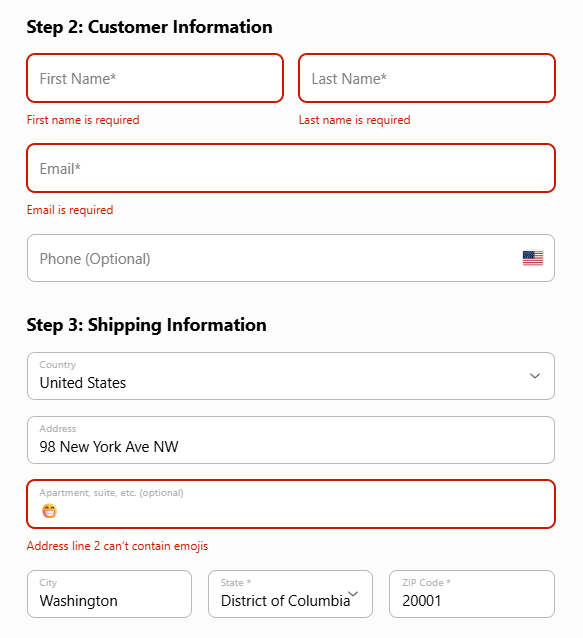
Watch out: Style a field by its name, with
[data-next-address-field="postal"], never by its row number. Rows differ per country, sodata-next-address-row="4"holds the city and postcode for one country and something else for the next.
Order bump
An order bump is a checkbox card that adds a second package to the order when toggled. From _includes/bump-check01.html:
<div data-next-package-toggle data-next-await="">
  <div
    data-next-toggle-card
    data-next-is-upsell="true"
    data-next-package-sync="1"
    data-next-package-id="7"
  >
    <div>Get Extended Warranty</div>
    <span data-next-toggle-display="originalUnitPrice">--</span>
    <span data-next-toggle-display="unitPrice">--</span>/ea
    <img data-next-toggle-image alt="">
  </div>
</div>
data-next-package-sync="1" keeps the bump's quantity equal to the cart quantity of package 1. data-next-toggle-display accepts per-unit tokens (unitPrice, stable across tiers) or line totals (price, which scales with the synced quantity). Pick one pricing style per card.
Payment
Payment methods are declared as radio sections. The card fields are the deliberate exception to "you write the inputs": cc-number and cvv are empty <div>s, and the SDK mounts hosted payment fields into them, so no card number ever passes through your page. From _includes/payment-methods.html:
<div data-next-payment-method="credit">
  <input type="radio" name="payment_method" value="credit" checked>
  <div data-next-payment-form="credit">
    <div data-next-component="credit-error">
      <div data-next-component="credit-error-text">Error message</div>
    </div>
    <div data-next-checkout-field="cc-number"></div>
    <select data-next-checkout-field="exp-month">
      <option value="">Exp. Month</option>
    </select>
    <select data-next-checkout-field="exp-year">
      <option value="">Exp. Year</option>
    </select>
    <div data-next-checkout-field="cvv"></div>
  </div>
</div>
The starter templates ship the same pair for paypal, klarna, apple-pay, and google-pay: each data-next-payment-method section with a matching data-next-payment-form and its own *-error / *-error-text slots.
The card is the only method that collects anything on your page. Every other method the SDK accepts, including iDEAL, Bancontact, SEPA Direct Debit, TWINT, Swish, Affirm and Link, is approved on the provider's own page: add the radio with the method's name and leave its data-next-payment-form empty. Submitting validates the form and captures the shopper's details as usual, creates the order, then sends the shopper to the address the orders API returns. Payment methods lists every value.
Express checkout is two containers; the SDK injects the wallet buttons into the second, in the order configured by paymentConfig.expressCheckout in your config.js:
<div data-next-express-checkout="container">
  <div data-next-component="express-error">
    <div data-next-component="express-error-text">Error message</div>
  </div>
  <div data-next-express-checkout="buttons"></div>
</div>
Order preview
The live summary renders the cart from a <template> using {item.*} tokens, with per-discount rows below it. Condensed from _includes/cart-summary01.html:
<div data-next-cart-summary>
  <template>
    <div data-summary-lines>
      <template>
        <div data-package-id="{item.packageId}">
          {item.quantity}x {item.name}
          <span class="{item.hasDiscount}">{item.originalPrice}</span>
          <span>{item.price}</span>
        </div>
      </template>
    </div>
    <div>Subtotal {subtotal}</div>
    <ul data-next-discounts="voucher">
      <template>
        <li>{discount.name} −{discount.amount}</li>
      </template>
    </ul>
    <div>Shipping {shipping}</div>
    <div>Grand Total: {currency}{total}</div>
  </template>
</div>
Create order
The submit button is a plain type="submit" button inside the form. No data-next-* attribute is needed. On submit the SDK validates, tokenizes payment, creates the order once, then sends the visitor to next-success-url with ?ref_id= appended so the next page can load the order (checkout-form.enhancer.ts › CheckoutFormEnhancer). The button is the only way to submit: Enter in a field moves to the next field, and the keyboard labels its Enter key to match (checkout-form/enter-key-navigation.ts › setupEnterKeyNavigation).
Debugging
Open the page with ?debugger=true. The Checkout panel lists every field the SDK matched, its validation state, and the raw data it will send, so a field that never reaches the order shows up before you submit. The Cart and Campaign panels confirm prices loaded. See Debugger.
Opening the debugger also puts the page in test mode, so pay with a test card while it is on.
Cautions
- The card field
<div>s must stay empty. The SDK mounts hosted fields into them; putting an<input>there means two competing fields and a checkout that cannot tokenize. Leave them as empty elements with thedata-next-checkout-fieldname. - An unrecognised field name is silently not part of the order. The names are fixed (
first_name, notfirstName;postal, notzip). If a value the visitor typed never reaches the order, check the spelling against the field names in this guide's examples. - Wrap price-bearing sections in
data-next-await. Without it the visitor sees placeholder dashes until campaign prices load. The hiding is done by the template'snext-core.css, keyed on thenext-display-readyclass the SDK adds to<html>. Keep that stylesheet on the page or the attribute does nothing.